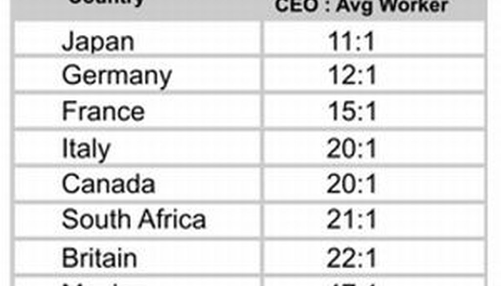
Say the ratio of CEO pay to average worker pay in the U.S. is 475 to 1.


Our only agenda is to publish the truth so you can be an informed participant in democracy.
We need your help.
This chart has been making the rounds on social media recently, with posters usually mentioning the Occupy Wall Street movement. We check its accuracy.

If you've got liberal friends and logged into Facebook lately, chances are pretty good that you've seen this chart. As people express their support with the Occupy Wall Street protests, they are citing this chart and similar statistics to show income inequality in the United States.
The chart -- here’s another version posted on the liberal website Daily Kos -- lists the ratio of CEO pay to average worker pay in the U.S. and nine other countries. The smallest ratio is Japan’s at 11 to 1. The United States is highest at 475 to 1.
We've gotten many reader requests to check the numbers, in part because the chart lacks any sourcing or additional explanatory information. But despite the lack of backup information, the chart has gone viral.
It's not only been posted and re-posted many times on Facebook, it's also appeared in countless blogs and been tweeted and re-tweeted on Twitter. The chart is the latest reminder that factual claims can spread at lightning speed on the Internet -- even when the facts to back them up are scarce.
Before we check the accuracy of the numbers, it's worth exploring where the chart began and how it went viral.
It's been repeatedly cited in blogs and reports, including one paper presented at a conference of a United Nations affiliate. The paper, written by Thomas Prosser of the Industrial Relations Research Unit at the University of Warwick in the United Kingdom, included the same chart that’s now circulating, which it sourced to a 2005 paper by an M. Kroll titled, "CEO Pay Rates: U.S. vs Foreign Nations."
We located a scanned version of the paper on the Internet, and it did appear to be written by Prof. Mark Kroll. His institution wasn’t listed, but after some additional searching, we found that Kroll had been teaching at the Louisiana Tech College of Business in 2005 and that he is now the business dean at the University of Texas at Brownsville. But it turns out he didn’t write the paper after all.
"Actually, I am the ‘recipient’ of the paper you refer to," Kroll told us in an e-mail. "The paper was done as a class project by three of my students in a graduate class back in 2005. The 475-to-1 ratio that you reference is listed in a table in the paper the students wrote. They do not give a specific citation for the data in the table."
The paper’s cover sheet fooled us -- as it fooled others -- because the professor’s name appears in the middle of the page, and the three students’ names appear together at the bottom in a less prominent spot. We tried to reach the co-authors -- Adam Choate, Dana Rowzee and Jerrod Tinsley, all of whom were working on their Master of Business Administration in 2005 -- but we did not hear back.
So how about the substance of the chart?
From previous fact-checks, we knew that American CEOs are generously paid, and we had confirmed that for ordinary Americans, incomes are stagnating.
But on the specific comparison of CEO pay and average-worker pay, we found two liberal groups -- the Economic Policy Institute and the Institute for Policy Studies -- that have produced long-running studies of this question.
The most recent chart from the Economic Policy Institute shows a ratio of 185 to 1 for 2009. According to the group’s calculations, the peak since the mid 1960s was almost 299 to 1. But it was never as high as high as 475 to 1.
Meanwhile, the most recent ratio from the Institute for Policy Studies is also smaller -- for 2010, it was 325 to 1. In previous years the ratio on two occasions has exceeded 475 to 1 -- to be specific, 516 to 1 in 1999 and 525 to 1 in 2000.
The Institute for Policy Studies’ ratios are higher than the Economic Policy Institute’s due to methodological differences. Sarah Anderson, who has co-authored the Institute for Policy Studies reports, said the figures can vary depending on several factors, including which CEOs are sampled and what types of compensation for both the CEO and the worker are used in the calculation.
Still, both of the years where the CEO pay ratio in the IPS study was at least 475 to 1 came more than a decade ago, so data from those years would be of questionable use to policy debates today.
In addition, neither of the two groups that compiled these figures made comparisons of CEO-to-worker pay across different countries, as the chart circulating on Facebook does.
So what we’re left with is an unsourced, undated chart with numbers that, at best, were only correct (approximately) in 1999 and 2000 according to one measure, and wrong according to a different measure.
Anderson of the Institute for Policy Studies said that for a paper written in 2005, a 475 to 1 ratio was not "crazy high," since the figure for 2004 in her group’s study was 431 to 1.
Kroll, the professor who graded the paper, added that "it would not surprise me if (the students’) number was ‘in the ball park.'"
Still, that argument doesn’t help today’s social-media posters. The data they’re circulating is at best six years old, and the ratios have fallen since then.
Our ruling
This is a textbook example of how claims can spiral out of control on the Internet. Just as conservatives have circulated unfounded claims about President Barack Obama's birth certificate, liberals are spreading this questionable chart.
We don’t doubt the chart’s underlying point that the ratio of CEO pay to worker pay is high in the United States, and is likely higher in our free-wheeling economy than it is in the historically more egalitarian nations of Europe.
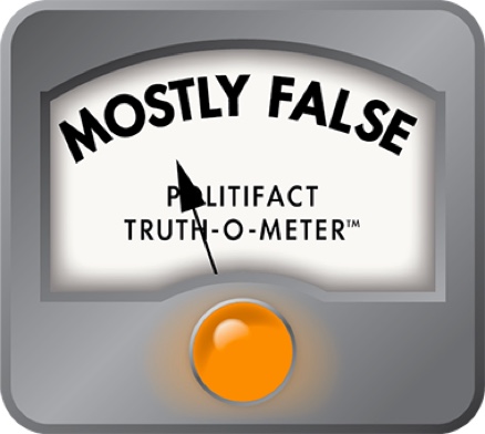
But in its claim that the U.S. ratio is 475 to 1, the chart conveys a sense of certitude and statistical precision that simply isn't warranted -- and which is contradicted by the facts. The latest number for the U.S. is 185 to 1 in one study and 325 to 1 in another -- and those numbers were not generated by groups that might have an ideological interest in downplaying the gaps between rich and poor. We rate the claim on the U.S. ratio False.
Chart, widely posted on Facebook
Daily Kos, "Chart of the Week: U.S. CEO:Worker Pay Ratio is 475:1," Oct. 6, 2011
Economic Policy Institute, "Ratio of average CEO total direct compensation to average production worker compensation, 1965-2009" (chart), accessed Oct. 10, 2011
Institute for Policy Studies, "Executive Excess 2011: 18th Annual Executive Compensation Survey," Aug. 31, 2011
Institute for Policy Studies, "Executive Excess 2006: 13th Annual Executive Compensation Survey," Aug. 30, 2006
Thomas Prosser, "Executive compensation and the economic crisis," (paper presented at a conference sponsored by the International Training Centre of the International Labor Organization), Nov. 2009
Adam Choate, Dana Rowzee and Jerrod Tinsley, "CEO Pay Rates: U.S. vs. Foreign Nations," Nov. 17, 2005
John Alexander Burton and Christian E. Weller, "Supersize This: How CEO Pay Took Off While America’s Middle Class Struggled" (paper for the Center for American Progress), May 2005
E-mail interview with Sarah Anderson, Global Economy Project Director at the Institute for Policy Studies, Oct. 10, 2011
Interview with Karen Conner, spokeswoman for the Economic Policy Institute, Oct. 10, 2011
Interview with Mark Kroll, dean of the School of Business at the University of Texas (Brownsville), Oct. 10, 2011


In a world of wild talk and fake news, help us stand up for the facts.