

This graphic has been circulating on the Internet since 2008. We check how accurate it is.
Many GOP-leaning states get more in federal funding than they contribute in federal taxes.
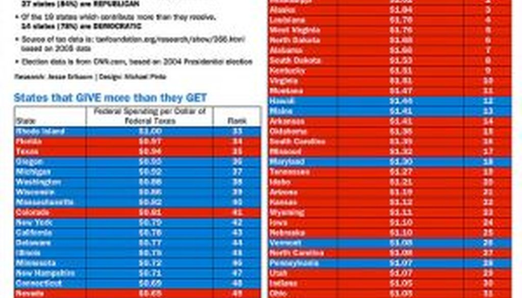
That's the point made by a graphic that’s circulating on the Internet, titled "Red State Socialism." A reader recently pointed us to it and asked us to check it out. The chart suggests that Republicans are hypocritical for bashing the federal government and federal spending, when Republican-leaning states are reaping the lion’s share of federal dollars.
The graphic emphasizes this point by showing two tables side by side. States that send more money to the federal government than they receive in federal spending are on the left, and they are primarily blue (or Democratic) states. The table on the right shows states that receive more in federal spending than they contribute in taxes. This table is predominantly red (or Republican).
The graphic says: "Of the 32 states which receive more than they contribute, 27 states (84%) are REPUBLICAN. Of the 18 states which contribute more than they receive, 14 states (78%) are DEMOCRATIC."
The source cited is a report by the Tax Foundation, a business-backed group. We checked with the Tax Foundation to see whether the data was legitimate and confirmed that it is. Spokesman Richard Morrison said that the chart uses 2005 data that was published in 2007.
So the graphic is solidly grounded in reality. But we see two reasons for caution when using this chart.
How do you define red and blue states?
The graphic defines Republican states as those "that have voted Republican in a previous presidential election." Because the data is from 2005, that means states that voted for George W. Bush in 2004, which is a larger number than voted Republican in 2008.
But the definition of states as Republican or Democratic isn't immutable. Just four years later, in the 2008 election, six states in the right-hand chart and three states in the left-hand chart switched from Republican to Democratic, making both charts more heavily blue.
We should also note that some of the margins of victory were quite narrow. In fact, a dozen or more states can be characterized in most elections as swing states, which might be more appropriately shaded in purple.
The data is seven years old
As we noted, the data is for 2005. To the author’s credit, this is disclosed prominently, and because it’s the most recent data of its type available, we can hardly fault the creator of the graphic for using it. Still, since the data has almost certainly shifted in the interim, particularly with the 2009 stimulus and the general increase in deficit spending, those patterns could have shifted as well.
"Because of the high deficit spending we’re seeing at the federal level, it’s likely that every state is currently receiving more in federal spending than its population paid in federal income taxes," the Tax Foundation's Morrison said.
We tracked down the creator of the graphic, Jesse Erlbaum. Erlbaum said he was inspired to create the graphic after watching a presidential debate scene from the television show The West Wing, in which fictional Democratic President Jed Bartlet needles his Republican opponent, the governor of Florida, for seeming to diminish the importance of federal funds that his state receives.
Erlbaum said he created the graphic "for fun" in October 2008, just before Barack Obama won the presidency. "Based on that, I selected the most recent previous presidential election cycle, namely 2004." That explains the chart’s use of older electoral data; it simply hasn’t been updated by subsequent posters. Erlbaum conceded the concerns we laid out.
"It's definitely true that choosing a different election cycle and basis for assigning red versus blue will produce different results," he said. As for the age of the data, Erlbaum said, "I would love to see an update of this report."
Erlbaum added, "I've listened to feedback about this chart for a few years now, and folks who don't like the insinuation it makes will always come up with some explanation. Popular ones are that there are more military jobs, more retirees, more farmers, and fewer cities in red states. I don't buy it. Whatever the excuse, the data is clear: These states receive more than they pay in. Everything else is just a rationalization based on someone deciding that one reason for spending money is good, and another is bad. This chart makes no such distinction. I say, ‘Deal with it!’ The facts are the facts."
Our ruling
The graphic’s data uses data from the 2004 election rather than 2008, and the figures on taxes and spending date back to 2005. There are fewer states that would be labeled Republican based on the 2008 election, and there’s a strong likelihood that tax and spending data would have changed as well. Because of this likelihood, we downgrade the accuracy of this generally accurate chart to Mostly True.
Flickr post, "Red State Socialism," accessed Jan. 26, 2012
Tax Foundation, "Federal Spending Received Per Dollar of Taxes Paid by State, 2005," Oct. 9, 2007
Email interview with Richard Morrison, spokesman for the Tax Foundation, Jan. 25, 2012
Email interview with Jesse Erlbaum, creator of the "Red State Socialism" graphic, Jan. 26, 2012
In a world of wild talk and fake news, help us stand up for the facts.
