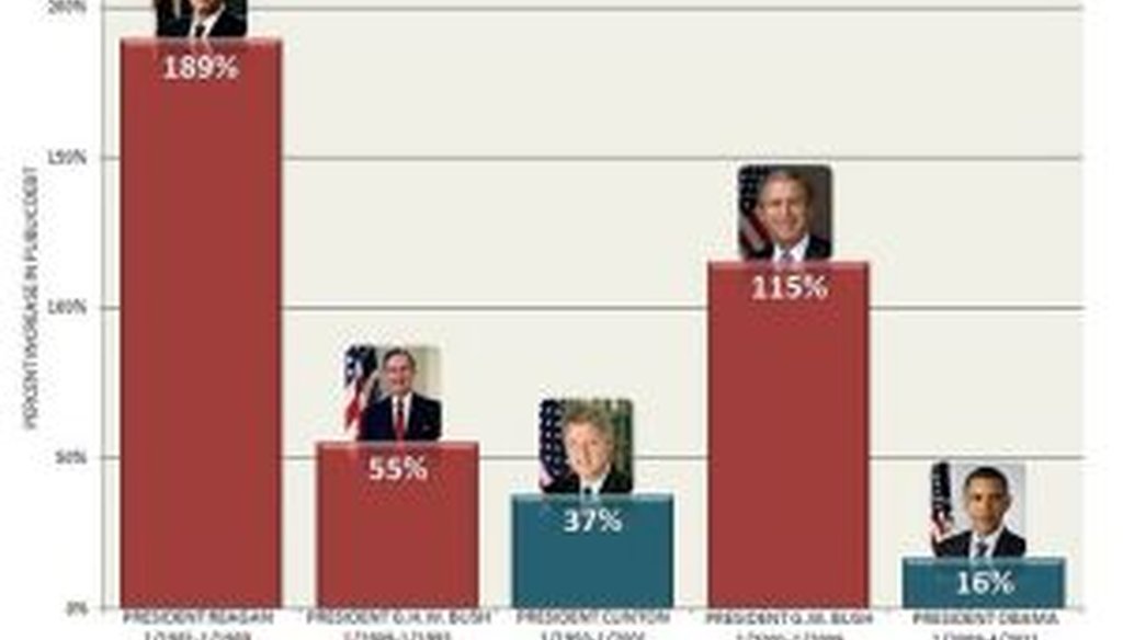


House Minority Leader Nancy Pelosi posted this chart on her Flickr site, where it was later re-posted by a user on MoveOn.org. But we found major problems with its math and methodology.
A reader recently pointed us to a post on the website of MoveOn.org, a liberal group. The post features a bar graph titled, "Who Increased the Debt?" that offers figures for the past five presidents:
Ronald Reagan: Up 189 percent
George H.W. Bush: Up 55 percent
Bill Clinton: Up 37 percent
George W. Bush: Up 115 percent
Barack Obama: Up 16 percent
We can see why a liberal group would tout such numbers, since -- if accurate -- they offer powerful counterevidence to the claims by conservatives that President Barack Obama has been a spendthrift who’s set the nation on an unsustainable fiscal path.
But the reader who sent it to us was surprised to see the debt increase under Obama was so small. So we decided to check the numbers.
The chart actually comes from a Flickr page belonging to House Minority Leader Nancy Pelosi, D-Calif., who posted it on May 5, 2011. Specifically, the chart tracks "percent increase in public debt" for the five presidents during the following time periods -- January 1981 to January 1989 (Reagan), January 1989 to January 1993 (George H.W. Bush), January 1993 to January 2001 (Clinton), January 2001 to January 2009 (George W. Bush), and January 2009 to April 2011 (Obama).
We checked with Pelosi’s office to see what data they used to assemble the chart. They referred us to the U.S. Treasury’s "Debt to the Penny Calculator."
First, we should note that we interpreted the caption in Pelosi’s chart that reads "percent increase in public debt" to mean public debt, not gross federal debt. Public debt is debt held by the public, whereas gross federal debt includes both publicly held debt and debt held by the government, such as money in the Social Security trust fund.
Despite what the chart’s label suggested, the data we received from Pelosi’s office made clear that they had been using the gross federal debt number. So we’ll start with that figure.
We can quickly dispense with the figures for Reagan and George H.W. Bush. The "Debt to the Penny" calculator doesn’t go back further than 1993, but we were able to estimate the figures for debt under Reagan and the elder Bush by using data from the Office of Management and Budget. OMB’s numbers are calculated somewhat differently than Treasury’s, but the percentage increases were close enough to what the chart said that we’re not going to quibble over them. OMB has debt under Reagan increasing by 186 percent (the chart had said 189 percent) and by 54 percent under George H.W. Bush (compared to the 55 percent in the chart).
Instead, we’ll focus on the numbers for Clinton, George W. Bush and Obama.
From the online calculator, we requested the daily debt totals since 1993 and picked out the ones closest to the inauguration dates of those three presidents, as well as the end of the month of April 2011. Here’s what we came with for gross federal debt:
January 20, 1993 (end of George H.W. Bush and beginning of Clinton): $4.188 trillion
January 19, 2001 (end of Clinton and beginning of George W. Bush): $5.728 trillion
January 20, 2009 (end of George W. Bush and beginning of Obama): $10.627 trillion
April 29, 2011 (closing date of the chart): $14.288 trillion
This allows us to determine how much the debt rose under each president:
Under Clinton: Increase of $1.54 trillion, or 37 percent
Under George W. Bush: Increase of $4.899 trillion, or 86 percent
Under Obama: Increase of $3.661 trillion, or 34 percent
So we can dispense with Clinton -- in the chart, his figure is correct. But the chart is significantly off for both Bush and Obama. We found Bush to have an 86 percent increase, not 115 percent as the chart said. And we found the debt under Obama to be up by 34 percent, more than double the 16 percent cited in the chart.
We quickly discovered the source of the discrepancy: Whoever put the chart together used the date for Jan. 20, 2010 -- which is exactly one year to the day after Obama was sworn in -- rather than his actual inauguration date. We know this because Treasury says the debt for Jan. 20, 2010, was $12.327 trillion, which is the exact number cited on the supporting document that Pelosi’s office gave us.
However this error happened, it effectively took one year of rapidly escalating debt out of Obama’s column and put it into Bush’s, significantly skewing the numbers.
Using the corrected figures does mean that, superficially at least, Democrats have a point. The debt did still increase more, on a percentage basis, under Bush than it did under Obama. But other problems with the chart and its methodology undercut even this conclusion.
• Time ranges: Bush served a full eight-year term, while Obama had served just 27 months by the time the chart was compiled. If the Obama figure were to be scaled out to a full eight-year period, he’d have a debt increase of 121 percent rather than 34 percent, making his increase greater than Bush’s. To be fair, that would be a simplistic exercise -- but no less misleading than the chart.
• Public debt vs. gross debt: Not only did the chart say it was using one statistic and then use another, it also cherry-picked the one that showed the comparison in a more favorable light. According to OMB statistics, public debt rose by 70 percent under Bush, 16 percentage points more slowly than gross federal debt did. And according to the Treasury, the public debt rose by 53 percent under Obama, compared with the 34 percent rise in gross federal debt.
Those numbers would have shown the two presidents much closer in their debt creation records -- and that’s without even adjusting for the vastly different lengths of time in office.
• Debt vs. debt as a percentage of GDP: Some economists will tell you that it’s not the size of the debt per se, but rather the size of the debt relative to the nation’s gross domestic product. This helps minimize the complicating effect of economic cycles and inflation. So how do those numbers stack up? Using OMB statistics, here’s what we came up with, using public debt figures not adjusted for the president’s time in office:
Reagan: Up 14.9 percentage points
George H.W. Bush: Up 7.1 percentage points
Clinton: Down 13.4 percentage points
George W. Bush: Up 5.6 percentage points
Obama: Up 21.9 percentage points (through December 2010 only)
So by this measurement -- potentially a more important one -- Obama is the undisputed debt king of the last five presidents, rather than the guy who added a piddling amount to the debt, as Pelosi’s chart suggested. Of course, all this goes to show that statistics can be used -- and misused -- to bolster almost any argument.
After we presented our research to Pelosi's office, a spokesman acknowledged that the office had erred in assembling and posting the chart and that it was in the process of reposting it. The updated version – which corrects the mathematical error but not what we consider to be the three additional design flaws – can be found here.
That's a step in the right direction, but it doesn't change our rating since it only occurred as a result of our fact-checking. We find so much wrong with this chart that we don’t think it contains any significant approximation of the truth. It made a major calculation error that dramatically skewed the debt increase away from Obama and toward George W. Bush. It glossed over significant variations in time served in office. It cherry-picked the measurement that was favorable to its cause. And it is contradicted by statistics for GDP-adjusted debt, which show Obama to be the most, rather than the least, debt-creating president of the last five. None of this suggests that Obama can’t turn things around as the economy improves (and Democrats can also take some solace in the fact that Bill Clinton did remarkably well in all of our measurements). But in communicating which administrations contributed the most to growth of the debt, this chart is a failure. We rate it Pants on Fire.
Nancy Pelosi, chart pasted on her Flickr page, May 3, 2011 (also available here)
U.S. Treasury, "Debt to the Penny and Who Holds It," accessed May 19, 2011
Office of Management and Budget, "Table 7.1—Federal Debt at the End of Year: 1940–2016," accessed May 19, 2011
E-mail interview with Gary Burtless, senior fellow with the Brookings Institution, May 19, 2011
Interview with Nadeam Elshami, spokesman for Nancy Pelosi, May 17, 2011
In a world of wild talk and fake news, help us stand up for the facts.
